I often get questions about what art materials I use for my floral paintings, so I thought I’d list some of my favourites here. I’m a firm believer that part of finding your style is experimenting with different materials so I hope you’ll find some supplies you love here. I’ll write a bit about the tools I love in each section and link to the specific tools I’m talking about below.
Just to note that some of the links in this blog post are affiliate links. I would never let this impact which tools I recommend, I’m only sharing my absolute favourites here. But using them means that, to no extra cost to you, you help me keep creating inspiring and helpful content for you like this guide.
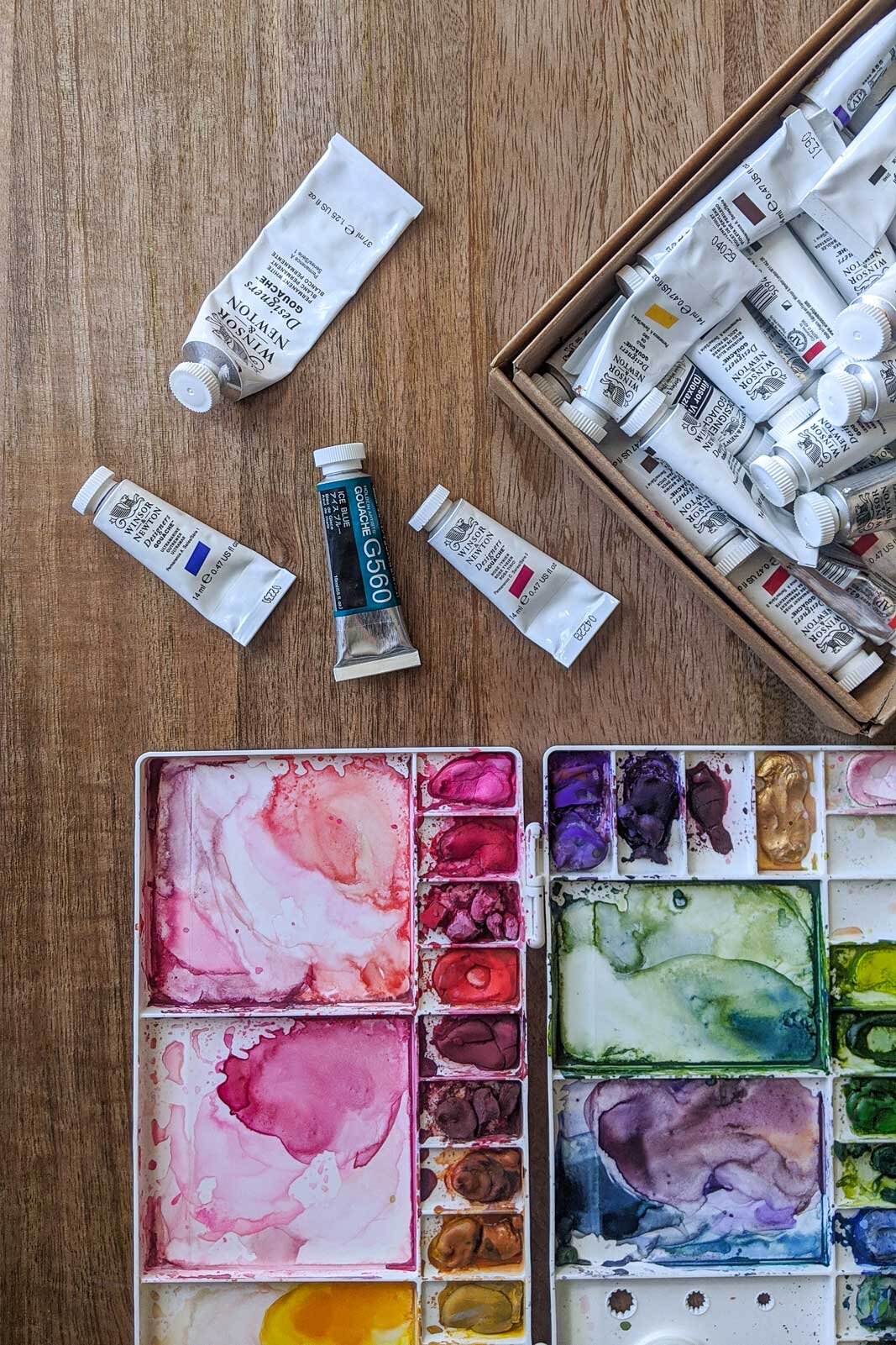


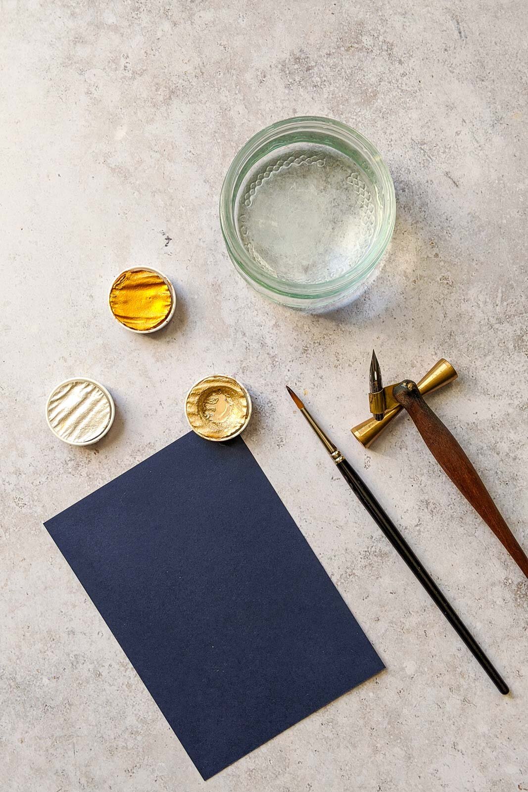
WATERCOLOUR & GOUACHE PAINTS & PALETTES
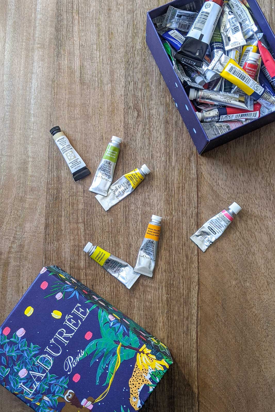
For watercolour I love the paints from Winsor & Newton and Daniel Smith and tend to use only the professional artist quality paints. They cost quite a lot more than the Winsor & Newton Cotman range but the pigment is so much richer (which means I don’t need as much pigment) and the paint goes on smoother. That said, if you’re just starting out or don’t want to splurge the Cotman series is a wonderful more budget friendly alternative. For gouache I pretty much only use Winsor & Newton Designer Gouache.
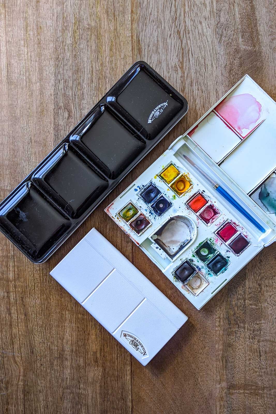
With paints you can either buy them as tubes or pans. When I started out with watercolours I got a palette with pans from Winsor & Newton and it was an excellent starting point. You get a palette with colours to get started straight away and they’re very easy to transport. If you like to paint quite small I find these work well with a small brush and I still like to use these when I travel.
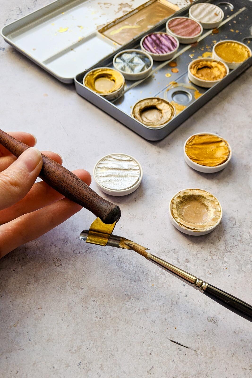
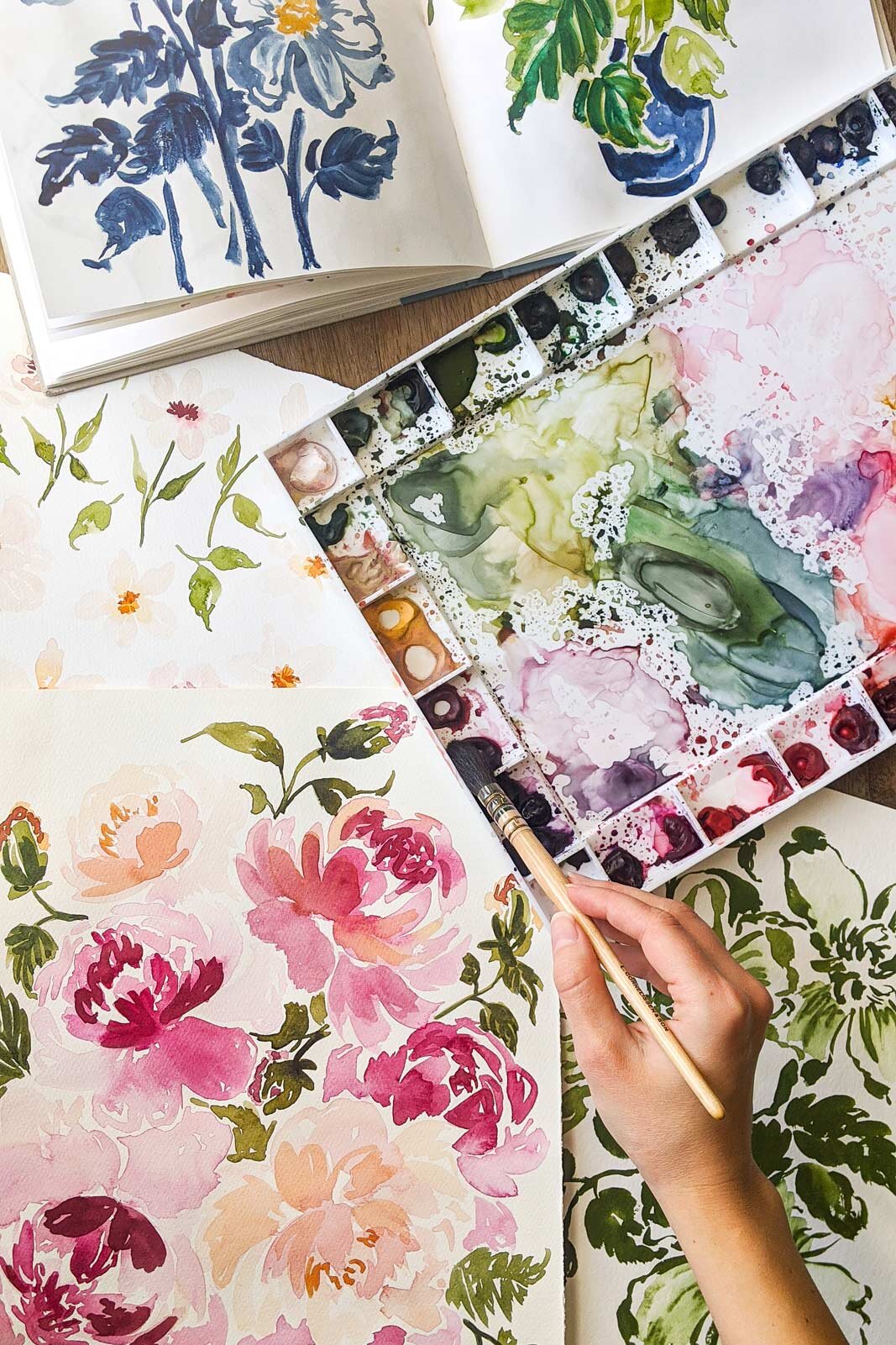
But my absolute favourite way to work is to buy paints in tubes and create my own palettes. I simply fill the empty pans with the colours of my choice from the tube and then let them sit to dry over night. I find drying them this way before using them by re-wetting them helps me control the amount of paint I pick up with my brush. For my looser florals I love using large brushes and want lots of space for mixing colours. I love using my John Pike palette for these. For my more detailed botanical paintings I have a smaller palette. I love this method so much I have done the same with a palette of gouache.
Paints (tubes & Pans)
Winsor & Newton Professional Watercolour Paint
Winsor & Newton Cotman Watercolour
Daniel Smith Watercolour Paints
Winsor & Newton Designers Gouache
Palettes
John Pike Watercolour Palette (my large palette)
Mijello Palette (my smaller palette)
BRUSHES & PENCILS FOR SKETCHING
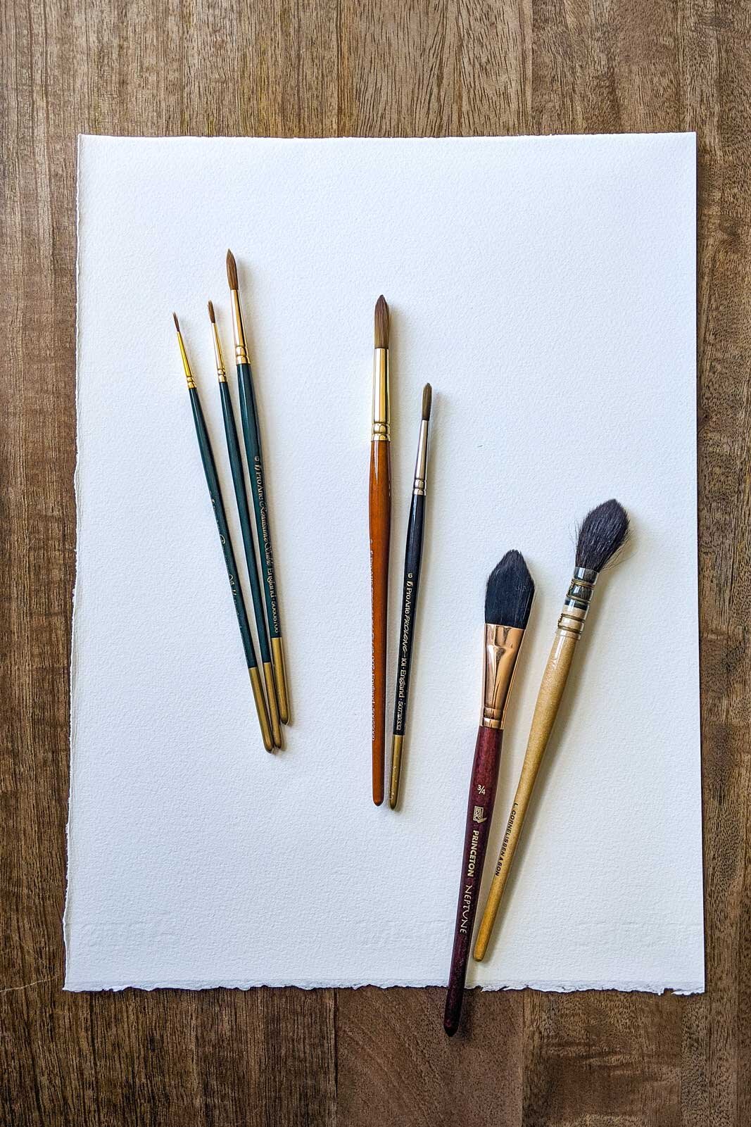
For brushes I think a couple of round brushes should be part of your essential kit. Then I like to add a couple of different styles that I can use for different types of mark making in my paintings. I like using the Pro Arte Renaissance Sable brushes in smaller sizes (from 3/0 to about 6) for more detailed paintings. For my looser paintings I have a range or larger brushes ranging from synthetic alternatives to a beautiful Da Vinci quill mop style brush. In general smaller brushes tend to be easier to control but I love the larger ones for looser styles. For me these are so much about trying some different ones and finding what you enjoy using. I’m linking some of my favourites below.
Round brushes (a great set of sizes for more detailed or smaller paintings)
Pro Arte: Renaissance Sable Watercolour Brush Size 3/0 (for the teeniest of details)
Pro Arte: Renaissance Sable Watercolour Brush Size 0
Pro Arte: Renaissance Sable Watercolour Brush Size 2
Pro Arte: Renaissance Sable Watercolour Brush Size 4
Pro Arte: Renaissance Sable Watercolour Brush Size 6
Larger brushes for loose florals
Pro Arte: Prolene Plus Size 10
Princeton Neptune: Oval Wash Size 1/2 in
Princeton Neptune: Oval Wash Size 3/4 in
Da Vinci: Petit Gris Pur Size 4 (mop style brush)
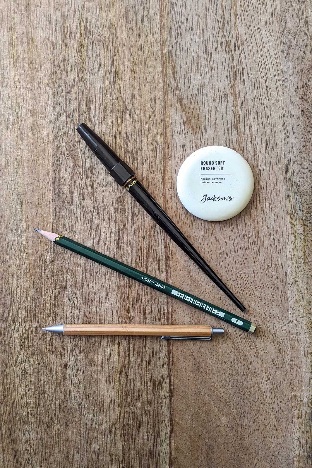
My favourite pencils and fountain pen
For drawing and sketching I have a lovely fountain pen with carbon ink that you can add refills to. I just love drawing with ink, there’s something about not being able to erase it that I really enjoy. And for my loose paintings I rarely sketch onto the watercolour paper. But for my more detailed paintings I do a very faint sketch with a graphite pencil. You want to make sure it’s super light so you can erase the lines after your painting is dry.
Platinum Carbon Drawing and Drafting Fountain Pen
Faber Castell F (my favourite for faint drawing onto watercolour paper)
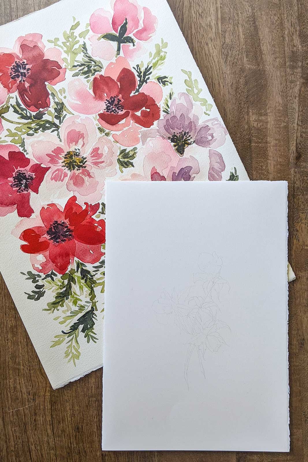
WATERCOLOUR PAPER & SKETCHBOOKS
I love painting on loose sheets of paper rather than watercolour blocks and my favourite brand is Fabriano Artistico. I like the texture of the not press for loose florals where I use more water and the hot press for more detailed paintings.
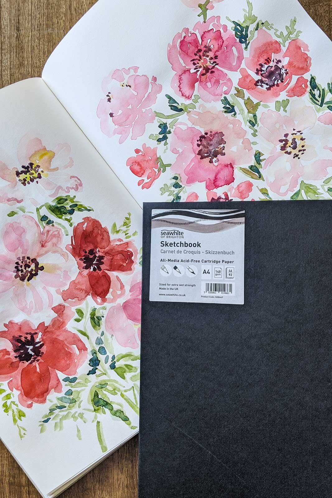
For loose floral sketches I use a sketchbook from Seawhite of Brighton that is 140 gsm. If you use a lot of water with your watercolours it’s probably worth getting a sketchbook with watercolour paper. But for me this is perfect for loose sketches using gouache. And since it’s just a sketchbook I don’t mind if the paper buckles a bit or it isn’t perfect.
I hope that is helpful and not too overwhelming. I use quite a few different materials and wanted to make sure to include options depending on what type of painting you want to do and how much you want to spend on materials. Let me know if you have any questions.